Customer story / The move to FUEGO

nuuds makes 40% of its online revenue in its app.
nuuds sells in drops, and some of them go only to app users. It moved the app to FUEGO in under two weeks, with no downtime and no lost push subscribers.
- 40%of online revenue, through the app
- +35%app sales after the move
- +48%app sessions
- +22%average order value
App share: 12 months to October 2026 · Move results: FUEGO’s nuuds customer story, July 2026
- Moved in under 2 weeks
- Zero downtime
- No lost push subscribers
Mobile app salesOld app = 100
After the move+35%
Stage 1 / Drops
Four in every ten online dollars come through the app.
nuuds is a lifestyle fashion brand that sells in drops. Some drops go only to app users.
That share counts all of nuuds’ online revenue, drops and everything else.
Share of nuuds’ online revenue, 12 months to October 2026
In nuuds’ App Store listing
- Product releases and drops just for app users
- Updates on the latest drops and events
Stage 2 / The move
The app stayed open the whole way through.
Switching platforms can take an app offline or lose its push audience. Neither happened to nuuds.
-
Timeline
Under 2 weeks
That’s start to finish.
-
Uptime
Zero downtime
The nuuds app stayed open to shoppers through the switch.
-
Push audience
No lost push subscribers
Anyone with notifications on still had them on afterward.
Stage 3 / The results
After the move, the app got more visits and bigger orders.
Measured against the old version of the same app, selling the same catalog.
The catalog stayed the same.
After the move, the app brought in 35% more sales, on 48% more sessions and a 22% higher average order value.
Index · nuuds’ old app = 100
Mobile app sales+35%
App sessions+48%
Average order value+22%
new app ratings for nuuds in 12 months
Cutscene / In his words
Rob Fletcher, co-founder of nuuds, on the new app
Nuuds got a new app and it’s SICK. Huge shoutout to @Rafi0x and the Fuego.io team. Their platform is insane.
Checkout the before and after below. It works even better if you download it on your phone and turn on notifications.
Posted on X by @robfletchr
Stage 4 / Screen by screen
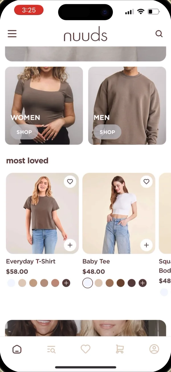
How the app changed, screen by screen.
Home, browse and buy, in the order a shopper meets them.
-
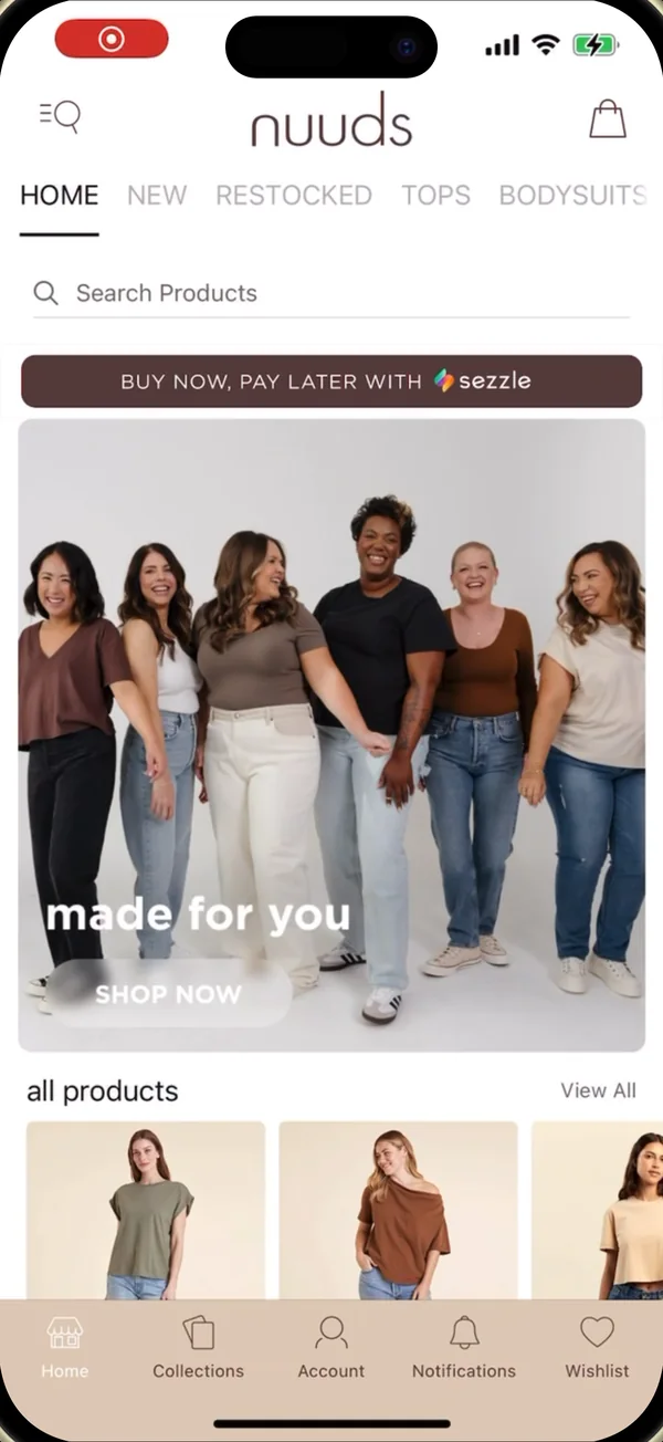
1 / 3 · Home
Home screen
The generic storefront became a branded, editorial home screen.
Before
- Text tabs and a search bar up top
- Pay-later banner above the hero
- A row of small product tiles
On FUEGO
- Full-width brand hero with Shop now
- Large product tiles
- Icon tab bar with wishlist and cart
Before 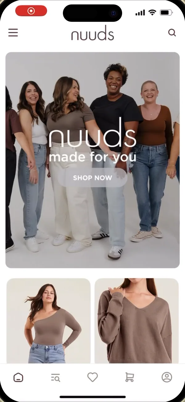
After · FUEGO -
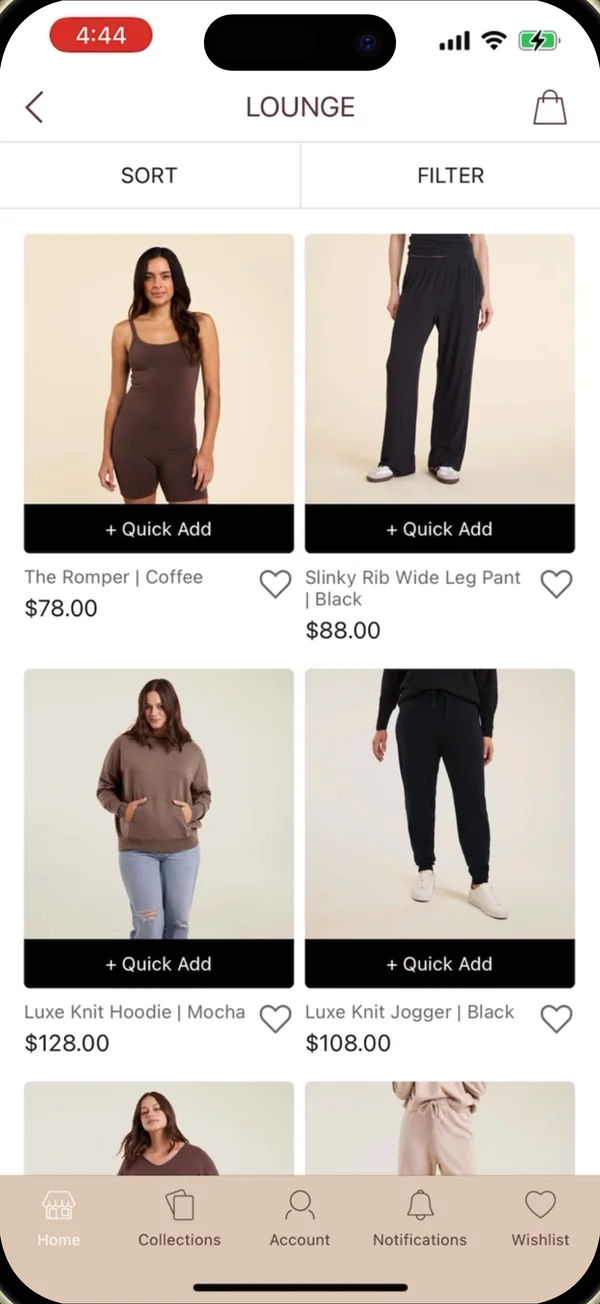
2 / 3 · Browse
Product listing
Basic sort and filter became fuller filters, with color swatches and quick add right on the grid.
Before
- Sort and Filter buttons
- A Quick Add bar across each photo
On FUEGO
- Women’s and Men’s tiles above the grid
- Sort, Size, Price and Color chips
- Color swatches and a quick-add button on every product
Before 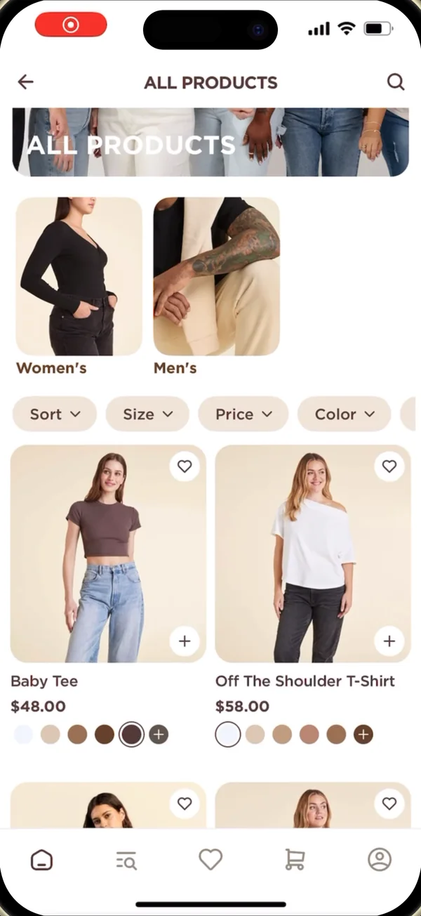
After · FUEGO -
3 / 3 · Buy
Product page
The buy screen now shows the star rating and groups the colorways.
Before
- One row of color swatches
- Size buttons
- Add to Bag and Apple Pay
On FUEGO
- Star rating with review count
- Colorways grouped as Core, Limited and Heathers
- Pay-in-4 price beside the title
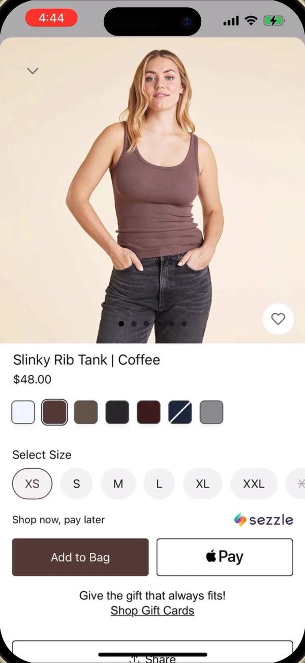
Before 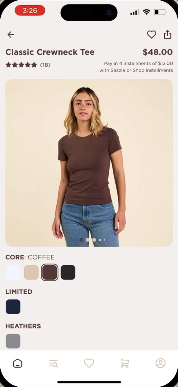
After · FUEGO
Ready to make the same move? We can have you moved in under two weeks, with a 15% performance guarantee.
Continue?
Continue
Ready to make the same move?
We can have you moved in under two weeks, with a 15% performance guarantee.
Credits / Fine print
Where this comes from.
The move results and migration details come from our nuuds customer story (July 2026), which compares the FUEGO app with the old one. The ratings figure counts new ratings over 12 months.
Rob Fletcher’s quote is from his post on X, and the screens are the ones featured in the story.
Prepared by FUEGO · 2 November 2026